
How to Design Small Business Websites for Mobile Phones and Tablets
It is becoming increasingly important, especially for small businesses, that your website is accessible on mobile devices. Prolific use of mobiles and tablets has reshaped the way in which web developers such as I have to think about designing and building websites.
Mobile phones with their miniature dimensions and touch-screen navigation present new challenges. These issues can only be overcome by breaking down the pre-existing model of a website and realising what users really want from your website. We have done the research so you do not have to! Here is our list of top-tip-improvements to make to your website to better facilitate mobile users.
Content is King
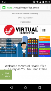
Users come to websites with an objective. It may be to find contact details, browse the products available, or read more about a specific product or service. Users tend to get frustrated if they cannot access the information they need quickly. Frequently designers forget that this is the primary function of a website and overload the user with needless sliders, images, news banners and popups that distracts the user from the task in hand. Try to bring the content to the top of the page, limit the amount that the user has to scroll below the page fold to view the important information on the page.
We provide website development and design, to read more about the services we provide click here.
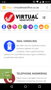
Videos Vital
The world is becoming increasingly busy, visitors have less time to spend scrolling through your content. That is why on the Virtual Head Office site we place videos at the top of every page that concisely explains what that particular product entails. We have tracked better visitor retention since adding videos to our website. Truly a must-have for small businesses looking to massively boost their website engagement.
We produce promotional videos for small businesses, contact us to learn more about our services.

Never Neglect the Number
Presenting your contact number to mobile users is possibly one of the more important design decisions to consider. On the Virtual Head Office website we place our phone number at the top of the page, therefore making it really easy for mobile users to get in contact with us.
Final word
When developing your website consider a few of these tips to ensure a happy visit for mobile surfers. Maximise your audience by designing your website for a wide array of devices and mediums.


